Skinny Dipping in Commercial Art and Pop Culture
Revised 2/14/26 Added one image to Print Ads and one to Merchandising
Resource 1 contains several examples of fine art depictions of nude male swimming. Indeed, late-19th-early 20th century American painters such as Thomas Eakins and Winslow Homer treated aquatic male nudes. Examples of fine art photography on this topic are presented in various other postings on this website. But besides these serious artistic immortalizations of that bygone era, there was the unapologetic commercialization of nude boys enjoying a cooling swim on a summer afternoon.
The nostalgic recollections of the “ol’ swimmin’ hole” seeped into the mainstream as a theme of illustrations and advertisements, ostensibly reflecting cultural norms and values. Indeed, the phrase itself became a code for nude male swimming whenever and however it occurred. Based on the evidence on hand, use of this theme may have been at its peak in the period from 1900-1940 (or so) giving us a glimpse into what the society of that era felt was a normal, non-harmful activity.
Topic 1: Print Advertisements
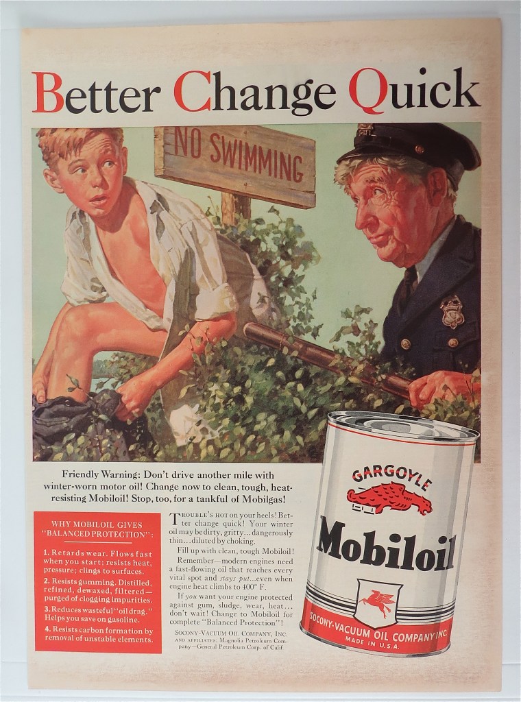
The ads that depict skinny dipping may have been designed to trigger nostalgic memories in the viewers (especially male viewers). The more facile ads used word play to reference skinny dipping as a metaphor for whatever they were hawking. This motor oil ad is a case in point.
And there was this one from 1943.

At least as clever is this Van Heusen shirt ad.

Cars? Surely anyone can see the parallel between a sporty ride and skinny-dipping, can’t they? This from 1925 – 100 years ago. In 2125 when someone finds ads from our era, I’m pretty sure they won’t see any naked boys.

The prize for persistence probably goes to this purveyor of summer-weight union underwear. They repeatedly used the swimmin’ hole reference to convince people that wearing their undies was the ideal way to beat the summer heat. Apparently time failed to vindicate their contention. Here is a series of their ads.

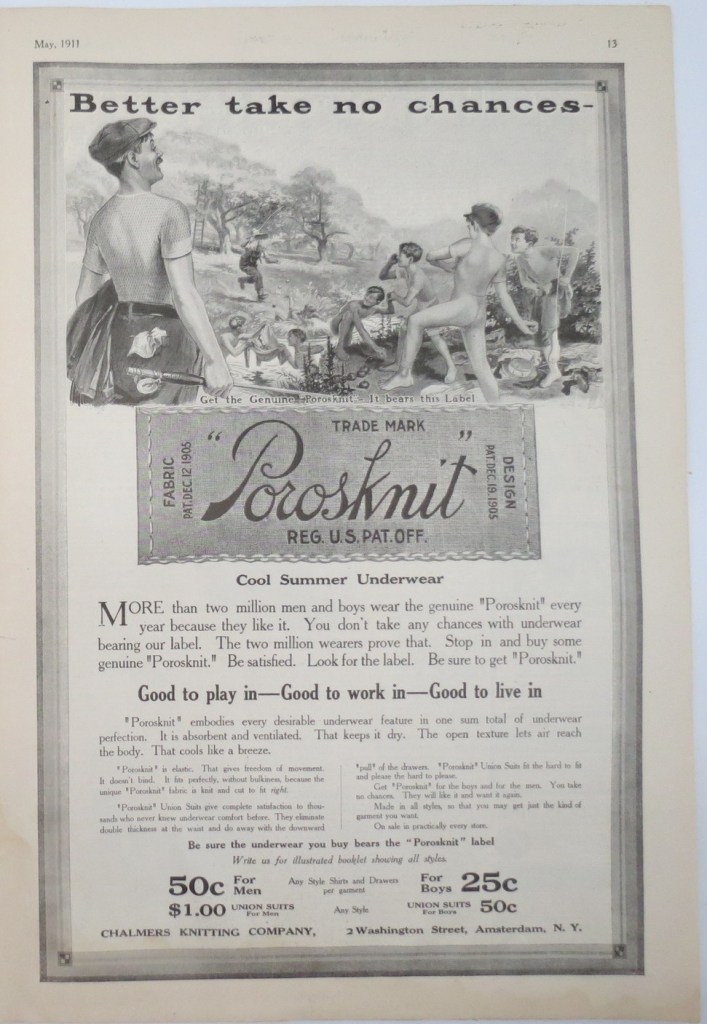
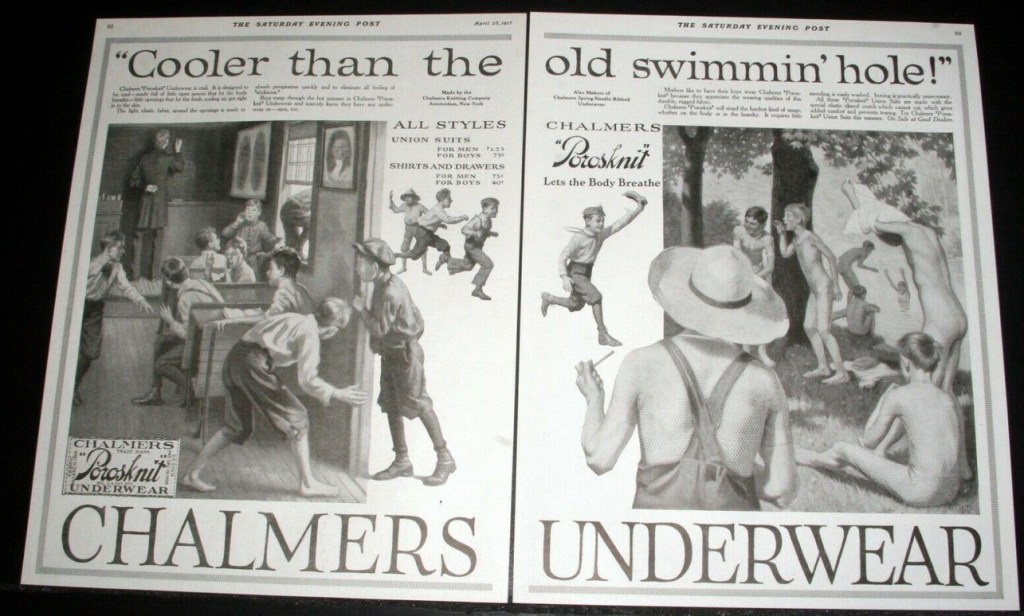
This two-page ad from 1917 is a chin scratcher. Are they trying to say that boys can strip out of their underwear more readily than with other brands? Pushing the point, they seem to be channeling Tom Sawyer with the straw-hatted lad clutching a corncob pipe. Note that in all these ads except for the figures actually in the water, none of the boys is nude. They’re all in close-fitting, button closure union suits. Yes, sir, that’s real comfort.

The text of this 1928 ad for bicycle coaster brakes appeared in a magazine aimed at young male readers. Inspecting the photo suggests that the image of the parked bicycle was superimposed on a photo of skinny-dipping scene. The message does seem to follow the theme of the image, so these guys get a passing grade.
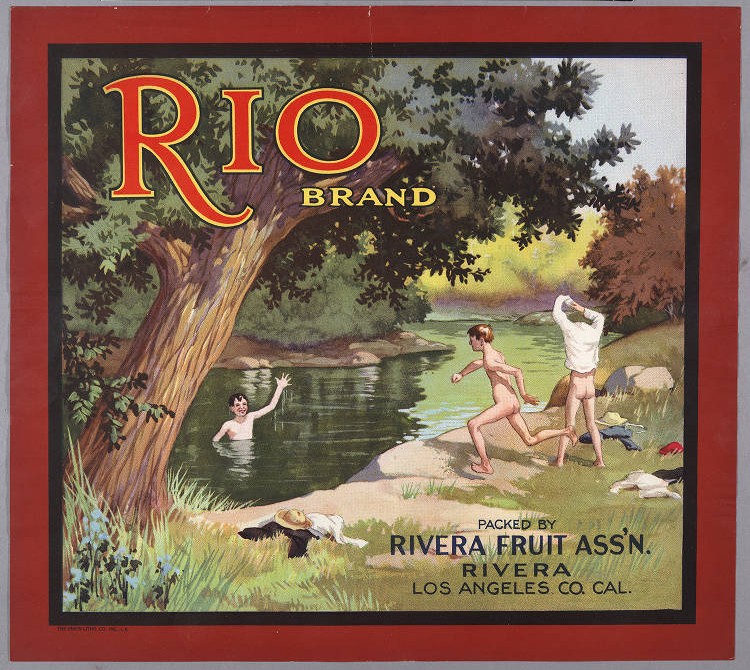
Not sure what bare-bottomed boys has to do with fruit, but it was probably an innocent attention getter. Date: 1943.

This one leaves me cold. What does skinny-dipping have to do with fire insurance? Maybe they meant: “Don’t go bare. Get covered with National Liberty insurance.” Background information suggests this ad dates to 1925-35.
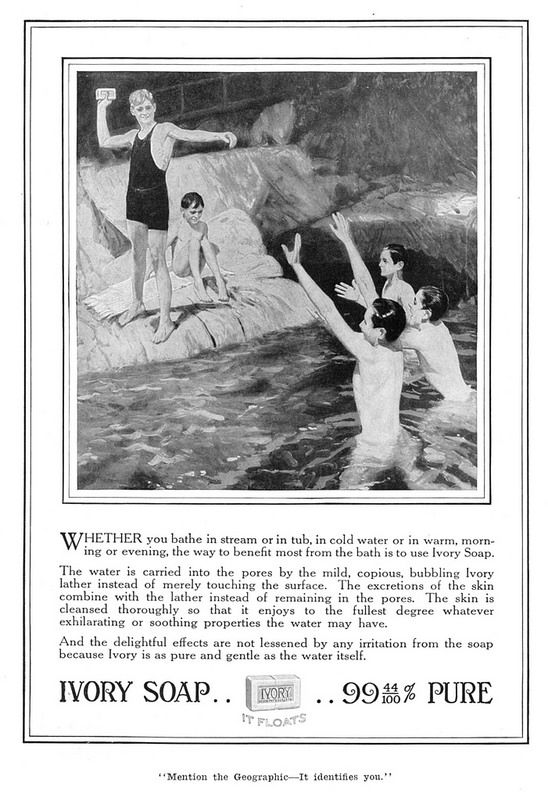
This 1915 ad for bath soap is right down the middle of this topic. The connection between the obviously nude male swimmers and bathing soap is completely appropriate.
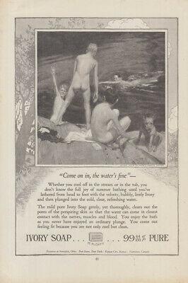
“If something works, stick with it.” Here is another Ivory Soap magazine ad invoking the same skinny-dipping tie-in in 1918.
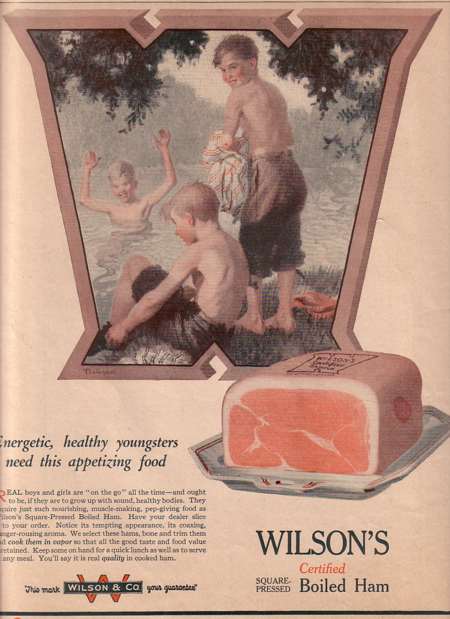
The message here seems to be that healthy young boys engage in skinny dippy. Of course.
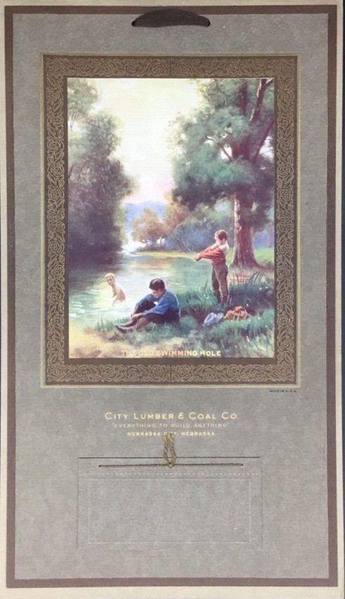
Another type of print advertising was the give-away. Instead of paying for newspaper and magazine ads that may or may not reach your targeted audience, hand out items of nominal value and some utility in your local community. Down through the years, these have included pencils and pens, paper weights, shopping bags and refrigerator magnets – all emblazoned with the advertiser’s name and message. Probably the king of the give-aways was the wall calendar. Pinned up in a prominent place, so it can be consulted readily, your offering is always on view waiting for the moment that it is needed. Of course, it needs to have an attractive graphic so the consumer will want to hang it. In 1924, the City Lumber & Coal Company chose a skinny-dipping scene (Labeled “The Old Swimming Hole”) for its calendar art.
Topic 2: Magazine Covers
The Saturday Evening Post magazine traces its roots to Benjamin Franklin’s Gazette of colonial Philadelphia. Although it had a checkered history, it continues in publication to this day – now as a non-profit membership organization. The one outstanding contribution of this storied publication was its commitment to great cover art. As a matter of fact, a collection of its cover illustrations would be considered a road map of changing attitudes and mores of middle-class American society over the decades.
Needless to say, the theme of young boys skinny dipping received repeated treatment on the Post’s cover. Here are three examples that span the period of 1911 through 1929.


The Post did not have a monopoly on the theme, however. Collier’s (1888-1957) was a weekly magazine that specialized in investigative journalism and serious fiction. It nevertheless recognized the attention-getting value of cover art. It dipped into skinny dipping on at least one occasion.

McCall’s was one of the premier women’s magazines of the 20th century. It had roots that stretched back to 1873 and lasted in one form or another until 2002. Beginning in 1932, each issue contained three sections, each with its own cover art. This was a cover of the Homemaking section in 1933. What does a painting of three nude boy swimmers have to do with homemaking? Beats me.

McCall’s was apparently not an outlier. At least one ladies’ magazine in Australia also found cover art depicting young boys skinny-dipping appealing to their readership. I’m guessing that mothers found the uninhibited innocence of the practice endearing. This example is purported to date from 1934, the same period as the McCall’s cover.

The Farm Journal magazine was founded in 1877 and continues in circulation today as the leading publication in its field. This Depression era cover featured the ever-popular skinny-dipping theme – an upbeat topic during one of the bleakest times in American agriculture.

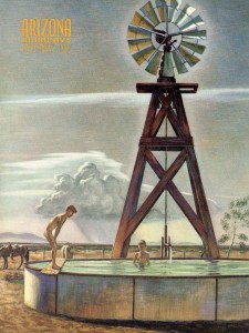
The magazine, Arizona Highways, has been in continuous publication since 1925. It is a non-commercial product of the Arizona Department of Transportation. It treats the history, culture, scenery, etc. of the US southwest in monthly issues.
The cover of the November, 1953 issue featured a 1945 painting titled “Oasis.” The work was by noted New Mexico artist Peter Hurd. The topic of the cover graphic showed a uniquely southwest take on skinny-dipping. Two naked boys are taking a swim in a water storage tank being continuously filled by a windmill-driven pump in the midst of the dry scenery of a ranch. The water system itself was similar to installations that could be found on nearly any farm anywhere in the US at the time. But in the arid climate of the region, with little access to streams and lakes, the boys had found another use for the tank.
A boy named Buster Brown was the subject of a comic strip that ran from 1902 to 1923. The character entered the popular culture despite the fact that he was depicted as a lad with long, curly blond hair who habitually wore a puffy, effete outfit (usually pink) with a large ribbon bow tie and a wide-brimmed hat. Nowadays, he might be considered a strong candidate for gender reassignment. Nevertheless, the situations and adventures that he found himself in were all boy for the most part. The bottom line might be that Buster was a typical example of his sex, but merely followed his own fashion sense.
Beyond the comic strip, Buster found depiction in live theater and movies. In both of those situations, the male actors who portrayed him were members of the demographic we now refer to as “little people.” But the character achieved its greatest longevity as a brand of children’s shoes. The Brown Shoe Company licensed the rights to the character early in the comic strip’s existence and carried on for decades. In the 1940s and 50s, the company published a line of Buster Brown comic books which it distributed for free at its shoe retailers. Below is an example of a cover telling the tale of Buster’s skinny dippy exploits. The implicit message seems to be: “When you go swimming, of course you have to get naked.”

Topic 3: Merchandising
An enduring principle of commerce is that if it’s popular, monetize it. The theme of young boys swimming in their all together in a bucolic setting fit nicely into that mold. Moreover, there were no royalties to be paid. Probably the most prevalent exploitation of this theme was postcards.
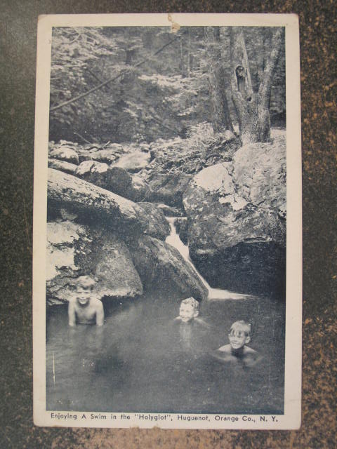
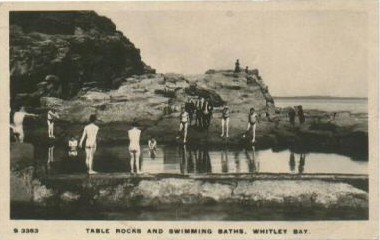
Picture postcards typically captured images of natural and man-made points of interest or activities peculiar to a particular place. Vacationers and visitors were the target audience for these types of wares. Curiously, if a locale had a well-known swimming hole, it might be the subject of a postcard picture. The following are examples of that.


This postcard is a bit more blatantly commercial. In the lower left corner “J.A. Croon and Co. Dist.” is called out. Some research by a diligent correspondent surfaced the fact that Mr. Croon operated a cigar store in this town and that the photo on the face of this postcard was of his three young sons and their buddies. A family photo used in business promotion – very economical. The publication date is 1911, but based on the ages of the boys, the photo may actually have been taken closer to 1900.
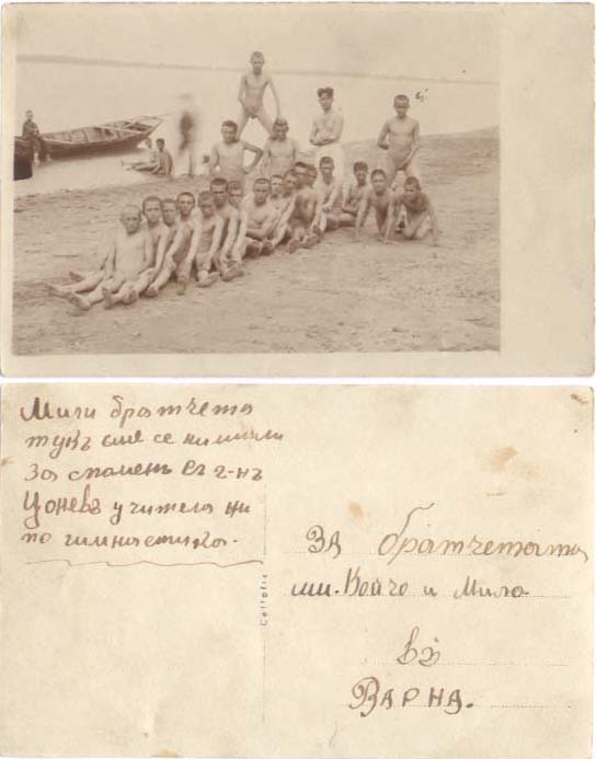
The script is indecipherable and there is no stamp or postmark. The photo looks like it could predate 1900.
Note that the boys standing up high in the water have dark bands around their middles. Either they all have matching swimming trunks or someone found it necessary to remove any suggestion of immodesty.
Only the four guys with frontal presentation are wearing swim suits, everyone else is nude. Coincidence? I think it more likely that the front-facing guys were outfitted with suits when the photo was processed for distribution.

Hove is a seaside resort on the southern coast of England. At some unknown time they saw fit to promote their town with this postcard photo of naked boys frolicking in the surf. It’s quite a crowd. You have to wonder how they were able to get that many bare bottoms together at once.

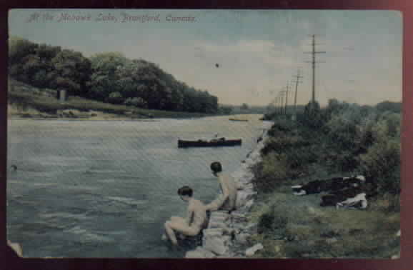
The location and date of this scene are as unknown as what this postcard was promoting.

Slightly less mysterious is this portion of a picture postcard. The surviving section alleges that the scene depicts ranch life in California. Indeed, the naked boy is diving off a cocked fence post into what seems to be an irrigation ditch. Equally cocked-up is the incomplete inscription. We are left to wonder what might have been shown in the portion that was deleted.

Although I can’t be certain, I think this was a promotional postcard for the mineral hot springs named in the sign. This is now a modern spa facility located near Ashland (Jackson County) in southern Oregon. The springs were used by Native Americans long before the white man stumbled by and took it over in 1857.
As can be seen, the place was a little rustic at this unknown date. The pool was first built in 1922, so this photo pre-dates that year. I would not be surprised to find that this image is a couple of decades older than that. Of course, the point of interest in this scene is the lad executing a hand stand, displaying his bare tush in the process.

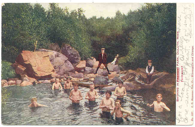
The printing along the border of this image that would have identified the location is long faded, but this is a familiar scene. We last saw it as a black and white photo in the Noteworthy Skinny-Dipping Scenes page. The scene is in Lester Park near Duluth, Minnesota in 1904.
The writer’s message is very legible. Calling out a date of Feb 4-07 (1907), it states that the temperature in the morning of that day was MINUS 36 degrees (Fahrenheit, no doubt). Fine, bracing Minnesota weather.
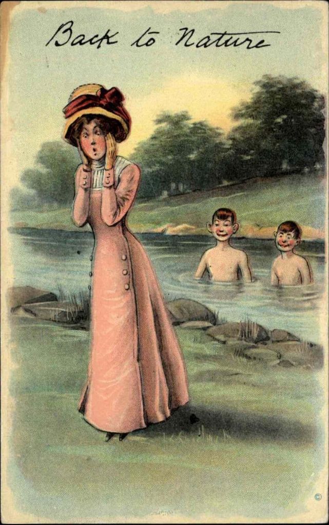
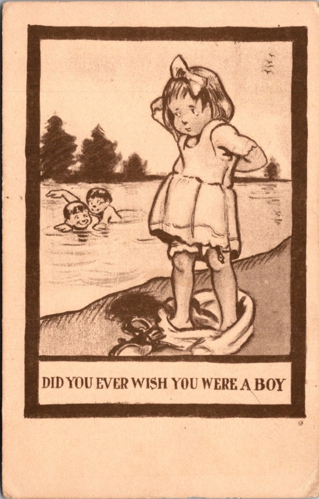
On the humorous side is this fanciful depiction of well-dressed matron (spinster?) reacting to the public nudity of two jug-handle eared scamps who are enjoying her discomfiture.
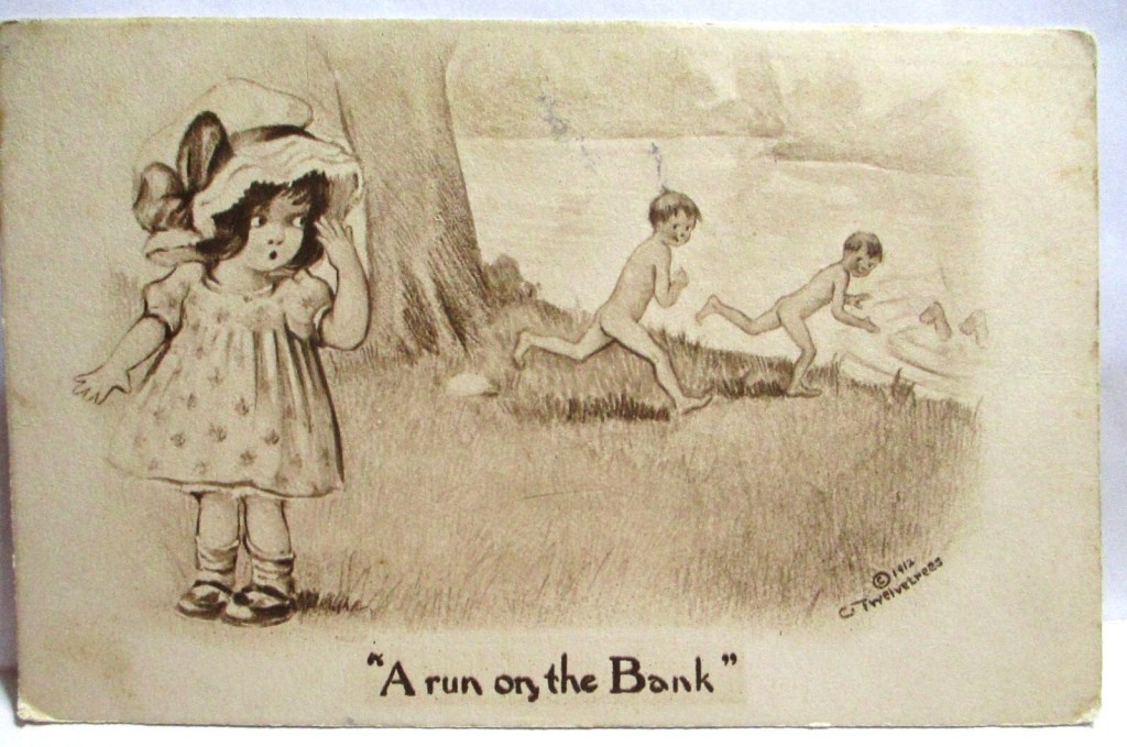
Produced in 1912, the title on this postcard is a play on words of a phrase that was used to indicate a public reaction to a rumored imminent financial failure. There may have been a more pointed meaning at the time this picture was published. Had there been a rash of bank runs in that time and place?
The scene appears to show a girl trying to disrobe to join the boys in a skinny-dip. She is being frustrated by the layers of her costume and also by the fact that the clothing fasteners are in the back. I’m not sure who the audience would have been for this undated little stab at humor, but I’m sure the laugh was intended to be at the expense of females.
But postcards were not the only form of graphic illustration to depict nude male aquatics. Check these out.
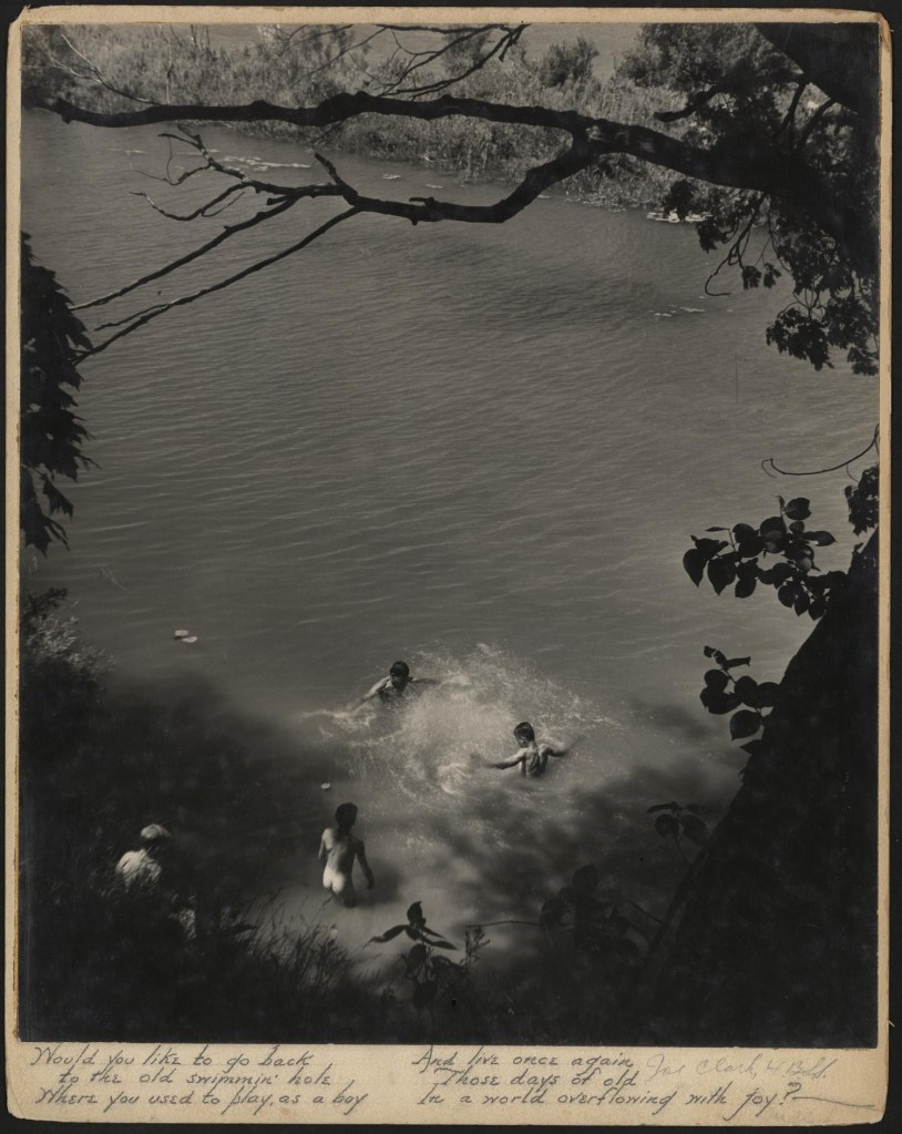
Not sure what this piece qualifies as. The print is mounted on cardboard and accompanied by some hand-lettered text (rhyme about the joy of the ol’ swimmin’ hole). It is signed by the photographer. It seems likely that it was intended for commercial distribution.
The photo is part of the body of work of Joe Clark, a professional photographer who was active from about 1939 to 1989. The collection of his works and those of his son, (wait for it) Junebug (!) are housed in the University of North Texas Libraries Special Collections as the Clark Family Photography Collection. The image is believed to date to the 1940s.
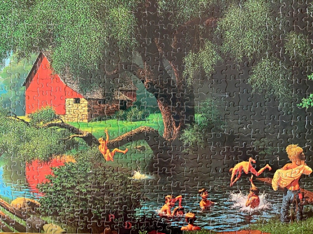
This jigsaw puzzle was published by Milton Bradley, the famous game company, in the 1980s. It includes all of the iconography of classic rural skinny dipping.

Henery Hintermeister was an artist/illustrator who produced nostalgic paintings that included our topic of interest. This opus was turned into a jigsaw puzzle. The copyright date looks like it might be 1954.

This more dramatic treatment of the same subject was also the work of Mr. Hintermeister. No indication of what form it was published in. Looks like the same dog.

On the grittier side, there is this sketch produced by an artist employed by the Depression era Works Progress Administration (WPA), a federal government program. It depicts boys seeking aquatic recreation on a ruined industrial site. The date of this work would have been between 1935 and 1943.
